Your Website: The Key To Winning The "Consideration" Stage Of The Customer Journey
As we continue through The Customer Journey, we now arrive at the Consideration Stage and your practice's website. Your website is a crucial part of the journey, and today, virtually every potential client will stop by there at some point.
Let's talk about your website
Love it or hate it, having a digital presence is a fact of life today, and it's vital for success in a veterinary practice. From talking with practice owners all over the country, I've found that very few really love their websites. It might be the hassle of making updates, or the fact that it looks dated, or it doesn't show up in search results; for these reasons and more, the website is a "pain point" for many practices.
Honestly, the state of veterinary websites isn't good. But you can do something about that!
And you can turn this to your advantage by having the best web presence in your community.
Your website is now the primary first impression of your practice

In the past, your building was the first impression of your practice. So you worked hard to create nice-looking signage, an inviting waiting room, and friendly staff to greet clients. These things still matter. But there's now an earlier impression of your practice that can determine whether that prospective client ever arrives and has the chance to see that beautiful practice.
Of course, I'm referring to your website.
Today, consumers go through 57% of the purchasing process before ever talking to someone. That means they're almost halfway done deciding whether to choose your practice before they have even called your friendly front desk staff – let alone seen that clean, friendly, and inviting reception area.
Today, consumers go through 57% of the purchasing process before ever talking to a person.
So to ensure that those prospective clients make their way to your door, your website must be effective. But what is an "effective" website?
Modern website = modern practice
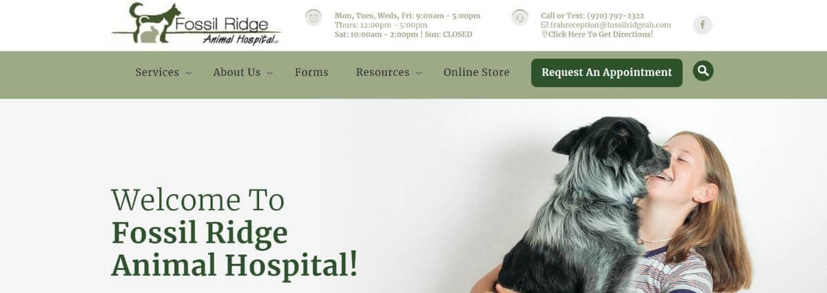
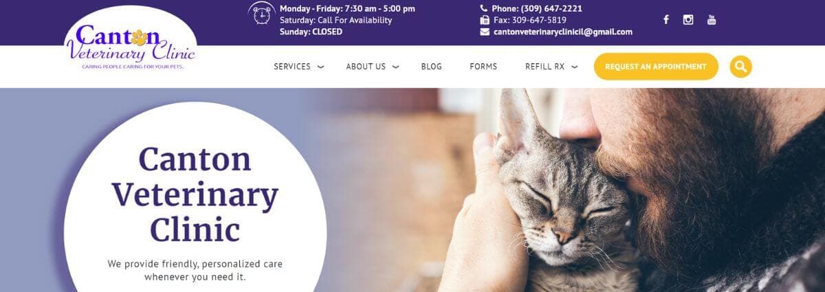
While there are many different aesthetic styles, the most fundamental point is that no matter your brand positioning, your site minimally needs to look current and modern.
Whether it's fair or not, people make decisions very quickly based on limited information. They literally do judge a book by its cover – if they didn't, there wouldn't be a whole specialized industry of marketers who design book covers to increase their sales!
Your prospective clients don't have the experience or knowledge to judge the quality of your practice by looking at your equipment, spaces, or instruments. But they need some way to decide whether your practice meets their standards.

As Nobel prize winner Daniel Kahneman points out in Thinking, Fast and Slow, when people are confronted with a difficult question, like "Is this a modern practice that will provide great care for my pet?" they often unconsciously substitute an easier question and answer that one instead – like, "Does this practice have a modern-looking website?".
It's not fair, but it's exactly what people do – including you and me. Every one of us makes snap judgments based on incomplete information. That's why it's critical to establish trust and reliability through your website. Your prospective patients can't tell a dated ultrasound machine from a modern one. But they can recognize a dated website when they see one. So your site must be up to the level of quality of your practice.
Sorry, it gets a bit worse before it gets better…
The other not-so-great news is where your prospective patient is getting their idea of what a modern website looks like. Think about the sites you visit daily – maybe you're checking out the news on The Wall St. Journal, shopping on Amazon or Nordstrom, or checking in with family and friends on Facebook. Each site is a marvel of technology and design, with tens or even hundreds of millions of dollars invested in creating a flawless user experience. So that's where your prospective client is … and they come over to your site … and arrive with the same expectations. So a dated-looking site that doesn't look right on a mobile phone – or a site that is thin on information or doesn't express your culture – will leave that prospect with a poor impression that will cost you business.
Ok, now finally, some good news
But the good news is, while our expectations about website experience have gone up dramatically, at the same time, it's become more cost-effective than ever to have a great-quality site that does meet those expectations.
In my agency career, I've overseen the development of many websites – most of them custom projects built from scratch. Our budgets for custom websites ran from $25,000 to $100,000 and beyond. Of course, you don't need to spend anywhere near that kind of money for a website for your practice because there are now many website options for site development that start with pre-built elements that can be customized for you, saving time and money.
So what does a great veterinary website look like today?
There are a lot of ways to look at this, but there are some basic principles:
- Modern: Clean, sharp design, with a simple aesthetic and minimal "frills"
- Branded: Communicates the culture, values, and unique philosophy of your practice
- Mobile-friendly: Works well on all devices, including smartphones and tablets
- Informative: Has excellent, informative content that positions you as an expert
- Fresh: Easy to update and manage, so you can keep it updated with fresh content
What is a "modern design?"
There are a few essential marks of a current, modern design:
- Clean, clear, consistent: Keep clutter to a minimum, and think about the small-screen experience. Avoid unnecessary decorative elements – using beautiful images, unique colors, and stylish fonts is fine. But watch out for funky borders, unnecessary drop shadows, and other "frills" that might look pretty but can slow your site down and distract visitors from your content.
- Unique and large typography: Back in the day, you had very few website font choices. That's not the case anymore. You should work with your designer to choose at least one unique font that can make your site feel more branded and memorable. Google Fonts offers many options and even suggests great "font pairings" for headlines and body text.

- Engaging images: Big, beautiful photos can help your site connect with visitors. These should be photos of your practice, your clients and patients, and your staff – not just "stock photos." You can get decent photos with just your smartphone, but if possible, I recommend finding a local freelance photographer to shoot some professional photos. Images should also be "responsive," meaning that your site needs to automatically size them to fit the screen, so they look good on all devices.
- Video: Video is the most powerful way to tell your story and represent your brand. Videos of your staff, doctors, clients, and patients establish trust and create visitor engagement. Video is also great for your search engine optimization (SEO) performance. Video also increases "conversion rates" – the percentage of visitors to your site who take the next step, such as calling your practice or requesting an appointment. Marketing software company Visually reports that video can increase conversion rates by 50% or more.
Using video on your site can increase conversion rates by 50% or more.
Your site needs to be an information resource
You've probably heard the term "expert positioning." Expert positioning means demonstrating that you are an expert in a field. In a veterinary practice, this means showing visitors that you are a knowledgeable and trustworthy source of information about their pet's care.
Many veterinary websites have minimal content and just list the services offered. This approach is no longer effective. To attract and engage visitors, your site needs to be rich, thoughtful, and educational.
Your clients trust you because you've demonstrated expertise and knowledge in the exam room. But since your next client's first impression is now happening online, you need to translate that knowledge and expertise into the content on your website.
Thorough, thoughtful, and insightful content is proven to improve your performance in search engines, driving 70% of all traffic to veterinary websites.
Creating all that content can be daunting. Of course, one solution is to work with GeniusVets – we provide a vast library of content already optimized for Google search. But that's not the only way – you can learn to produce great quality content. The key is just to get started and create something every week. Write one blog post or service page – whatever you can do – and build on that. We've also developed some clever ways to create content more quickly – reach out if you'd like to learn more!
Here are a few keys to success with your content:
- Address common questions thoroughly – just like you would in the exam room
- Give general information about health issues, procedures, options, and potential outcomes
- Provide up-to-date guidance and recommendations
- Refer to other trusted sources and authorities
- Cite recent data that support your recommendations
- You can provide "FAQs" that address common questions about a specific procedure
- Create blogs and videos addressing the latest developments
Weak content weakens your image as an expert practice. Strong content builds you up.
Help them take the next step
Of course, you'll need these visitors to convert for all of this effort to result in new patients and increased revenue. Remember, "convert" just means to move to the next step in their customer journey – in this case, it means picking up the phone or filling out an online form to schedule an appointment.
To accomplish this requires a call to action.
Don't make me think!

People are busier and more distracted than ever. As a result, they often don't have the attention span and focus to "figure out" how to take their next step. That means when we are marketing, we must spell it out very clearly. As simple as it sounds, people respond to direct commands in advertising and on your website:
- "Set an appointment now!"
- "Sign up for our newsletter!"
- "Call today!"
Every page of your site should have some call to action on it. Ideally, these should flow logically from the content and relate to an appropriate service. For example, a blog post about bad breath in dogs could contain a call to action such as "Does your dog have bad breath? Set an appointment for a dental exam!"
Making it all happen
Turning your practice website into a powerhouse marketing tool doesn't happen overnight. It takes some investment of time, energy, and usually some budget as well. But if you work with the right partners and allocate a reasonable amount of time toward it, you'll be well on your way sooner than you might think. As with any new undertaking, it might be difficult at first, but the more content you create and the more you lean into using your website to share your brand and culture with the world, the easier it will become.
Of course, if you'd like to "go deeper" on how to create a website for your practice that drives business results, book a demo with one of our many geniuses!

