4 Trends in Veterinary Website Design You Should Follow (And 3 You Shouldn’t)
There are tons of resources out there designed to promote the latest trends in website design and development. While some of them can work wonders for other business websites, not all of them are the best choice for veterinary websites.
Instead of chasing trends and using trial and error on your veterinary practice’s website, you’ll want to get familiar with the top trends everyone is talking about – and why some of them may not be the best option for your clinic’s website! Get your notebooks out because, in this blog, we’re delving into the trends you should and shouldn’t follow in veterinary website design to help ensure your online presence is a cut above the rest.

Why Veterinary Websites Are Different
B2C businesses and other consumer brands in industries like food and beverage, cosmetics, and lifestyle and fitness are typically the entities you’ll see making the most use of the latest web design trends. And while these trends can have great impacts on these brand’s sales and visibility, they aren’t necessarily suitable for every website – veterinary sites included.
Veterinary websites are inherently different from websites in other industries, and a generic cookie-cutter approach to design and development just doesn’t cut it. The users visiting veterinary websites have specific needs, preferences, and goals. Which is why practice owners will often turn to veterinary-specific website companies to ensure their platform meets the needs of their patients and community.
While many of today’s top web design trends seem fun, innovative, and exciting, it’s important to remember your practice’s purpose and let that guide what elements you choose to include on your website. To best serve your clients and community, it's important to strike a balance between informative content and visually appealing design. Your website should exude professionalism and trustworthiness while also being user-friendly, engaging, and adequately informative. Let’s dive into the trends that will help you do that.
Web Design Trends You Should Follow
1. 3D Models and Animated Content
As technology capabilities have evolved so too have the quality and types of visual content available for website pages. Visual elements like images, videos, infographics, and models have long been proven to aid in understanding.
In 2024, companies have better access to 3D models and animated videos than ever before, and are taking advantage of these abilities to add a more tactile and personal experience to online product and vendor research. In fact, in 2022 it was reported that in the ecommerce space, 82% of visitors to sites with 3D product modeling capabilities viewed and interacted with the product model, showing a strong preference for a more comprehensive understanding of products.
By leveraging 3D models and animations, you can provide pet owners with a comprehensive visual representation of common procedures, conditions, and treatments. From dog dental cleanings to orthopedic surgeries, these dynamic visuals offer a clear insight into the intricacies of veterinary care and can help pet owners feel more at ease with your clinic’s ability to perform certain procedures with their new found understanding, thanks to visual models.
At this point, you may be thinking, “Well, a 3D model of an iPhone is a lot easier to get ahold of than a model of a cat’s bone structure or an animation of tooth extraction for a dog.” Luckily for veterinarians around the country, these types of medical models and animations are becoming more readily available as well! For example, VisioCare’s veterinary medical library offers in-depth, medically accurate descriptions of common veterinary illnesses and procedures and supplements them with 3D models and animations. Check out an example of VisioCare’s models and animations in action and get your access to the VisioCare library today.
2. Multimedia Focused
Images and videos on websites are hardly a new trend. In fact, if you remember some of the first ever brand websites, you may remember a jumble of clip art images and bright, contrasting colors.
Multimedia content, such as videos, infographics, and animations, offers a more immersive and interactive experience for website visitors. Instead of relying solely on text to convey information, multimedia allows veterinary practices to communicate complex concepts and procedures in a visually compelling and easy-to-understand manner. For example, a video demonstrating the proper technique for administering medication to pets can be more informative and engaging than written instructions alone.
But one of this year’s top trends isn’t just about peppering a few videos and multimedia elements throughout your website; instead, it’s about letting multimedia take center stage and becoming a visual driving force behind your website’s storytelling and user experience.

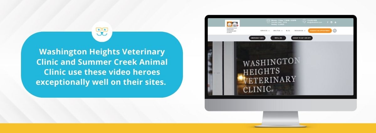
One way veterinary practices have been incorporating this trend into their own websites is by utilizing hero videos as opposed to static images in order to create a more interesting experience for visitors. Washington Heights Veterinary Clinic and Summer Creek Animal Clinic use these video heroes exceptionally well on their sites.
3. Chatbots
The world of veterinary medicine is fast, and visitors to your website will often be expecting instant gratification, regardless of whether they’re seeking out information or looking to book an appointment. Like many other fields, the veterinary industry is looking to chatbots to help streamline and automate certain tasks and functions to help veterinarians keep pace with growing demands and keep clients educated and engaged with their vet of choice.

According to web design agency Neon Goldfish, “A chatbot is a programmed chat interface a website visitor can interact with. They are programmed to closely mimic human behavior and interact with the website visitor in a conversational manner.” These chatbots can either employ AI or use a set of predetermined rules in order to answer prompts and assist customers.
One of the primary benefits of chatbots is their ability to provide instant assistance, regardless of the time of day or day of the week. Chatbots can be equipped with helpful features like FAQs, appointment bookings, and more, allowing your website users access to instant customer support, even outside of business hours. For example, pet owners that frequent your clinic may have urgent questions or require immediate support outside of regular business hours. With a chatbot in place, they can receive timely responses and guidance, ensuring their concerns are addressed promptly.
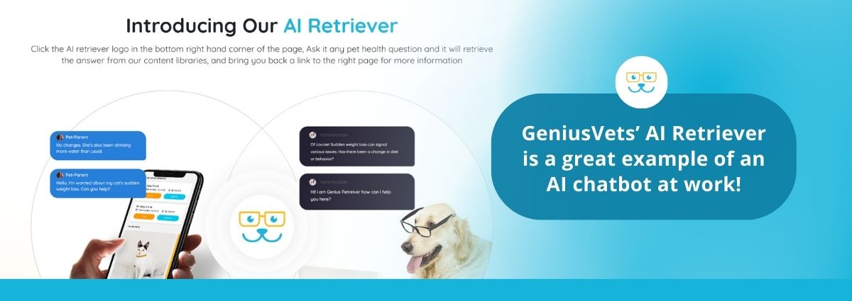
GeniusVets’ AI Retriever is a great example of an AI chatbot at work!
4. AI Artistry
As we discussed above, visual elements are the heart of web design and including multimedia on your veterinary website is a great way to engage users and create memorable informational experiences. But sometimes, you don’t have access to a great photo to go along with a description of a service or procedure or to use as a header image for your latest blog. That’s where AI imagery can help.
Instead of spending hours searching for the perfect stock photo or taking time during an appointment to make a patient pose for a picture, it can be a better option to leverage AI technology to create the perfect image for your website. However, if you do plan to follow this trend, be sure to thoroughly vet all of your photos before adding them to your website, as AI isn’t perfect and oftentimes has trouble generating small details, like in photo text or small facial features.
AI can also help you utilize your own images, as well as stock photos that you’ve licensed in more ways. Some photo manipulation tools now make use of AI to allow users to edit photos with generative fills, meaning, you can take an original photo of a vet at your clinic and slightly alter it to fit other purposes. For example, if you have a picture of a cat getting a shot, but want to use it elsewhere for an article on a specific type of veterinary needle, you can utilize AI to swap out the syringe into something more contextually appropriate. Think of it as making your images work for you!
Just be sure that if your practice chooses to utilize any type of AI on your website, whether it’s text or images, it's done so ethically and responsibly.
Web Design Trends You Shouldn’t Follow
1. Experimental Navigation
Navigational elements, like menus, link text, and buttons, are a core component of functional web design and have served businesses well, making their website user experience logical and easy to understand. However, designers have endeavored to push the boundaries of traditional navigational design and create a unique and memorable experience for users – resulting in the growing trend of experimental navigation.
While this trend may sound fun and exciting, don’t start planning your site’s navigation changes just yet. Innovation is essential, but overly experimental navigation structures can confuse visitors and hinder usability, which can be especially detrimental when your users are looking for urgent information or emergency recommendations. Instead, stick to intuitive navigation menus and layout conventions that are familiar to users. Your priority should be facilitating seamless navigation and access to critical information, not showcasing avant-garde or unconventional design.
2. Extreme Minimalism & Maximalism
Minimalism and maximalism are two ends of the design spectrum that are both incredibly popular right now. A recent study on the way the Millennial age group reacts to minimalism and maximalism defined the two in the following way: “The target with minimalism in web design is to design web pages that convey information, content, and features in a straight- forward and clear-cut way. The opposite of minimalism in web design is maximalism. In this trend, bold combinations of color, texture, images, graphics, and animations are embraced.” Extreme or ultra-minimalism and maximalism take these ideas and push them further to reimagine these tried and true concepts of design into new and timely trends.
While minimalism’s clean cut and straightforward design elements may sound appealing, they aren’t suited for a veterinary website that’s trying to educate users, instill confidence in clients, and stand out from competing clinics who likely offer a lot of the same services. The “less is more” approach likely won’t be helpful to pet owners who are looking for detailed explanations of surgical procedures, pictures of procedures, or what they should expect when visiting your clinic.
Maximalism, on the other hand, also presents its own unique challenges that make it poorly suited for veterinary websites. While it may grant you more opportunities to show off your practice’s personality and stand out from competitors, maximalist design can be distracting for users and make it difficult for them to discern what copy or visuals on a page are important – potentially hindering their view of your practice’s professionalism and capabilities.
Tip: Aim for a clean, uncluttered layout with strategic use of visuals and content to maintain interest without overwhelming the senses.
3. In the Moment Aesthetics
Y2K, brutalism, and scrapbook are just a few examples of the more popular aesthetic-based design trends being used by companies all over the world. Many of these design aesthetics are fun, nostalgic, experimental, and sometimes a little weird. Nexcess defines web aesthetics as “website aesthetic refers to the look and feel of the front end of a website or web application. Website aesthetic can be based on elements such as white space, color scheme, font, alignment, navigation, menus, imagery, interactivity, and more.”
Trends come and go, but timeless and on-brand designs endure. When designing your website, stay true to your brand and choose elements that authentically represent your practice and the goals you have for your clients.
Need help navigating what design choices will best fit your practice’s website? Get in touch with GeniusVets’ team of experts to talk about bringing your website to the next level.

